Introduction
The colour wheel is an essential tool in design and art, offering a visual representation of colours and their relationships. Developed by Sir Isaac Newton in 1666, it has become an indispensable guide for artists, designers, and anyone interested in the nuances of colour interplay.

The Basic Structure of the Colour Wheel
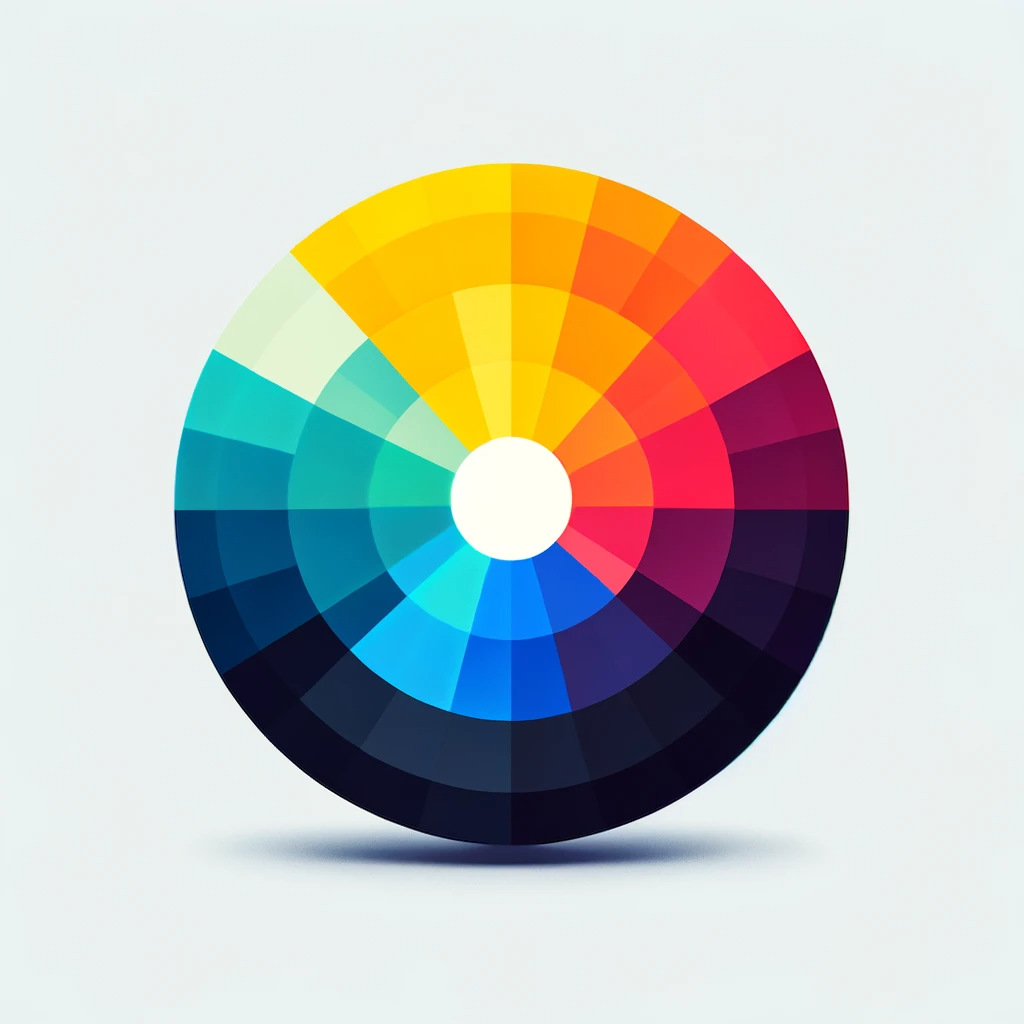
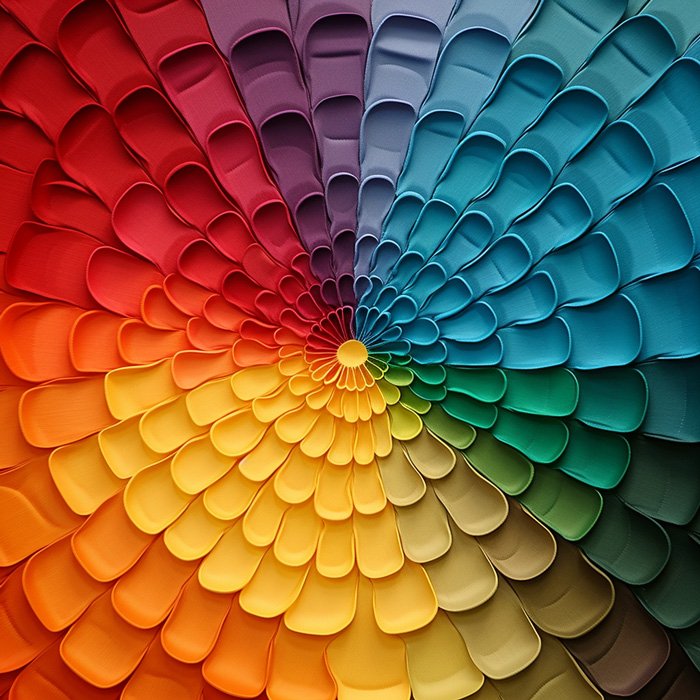
At its core, the traditional colour wheel consists of three primary colours—red, blue, and yellow—spaced evenly around the wheel. The secondary colours—orange, green, and violet—are created by mixing primary colours. Tertiary colours, formed by mixing primary and secondary colours, complete the wheel’s 12-part structure.

Colour Relationships and Harmonies
Colour relationships, also known as colour harmonies, are the foundation of effective colour usage in design. Understanding these relationships is crucial in creating visually appealing designs. Here are some of the most common colour harmonies:
- Complementary Colours: Colours directly opposite each other on the colour wheel, like red and green. They create a high contrast and vibrant look but must be balanced to avoid clashing.
- Analogous Colours: Colours next to each other on the wheel, often creating serene and comfortable designs. An example is a combination of blue, blue-green, and green.
- Triadic Colors: This harmony involves colours evenly spaced around the colour wheel, like red, yellow, and blue, offering vibrant visuals even in muted shades.
- Split-Complementary Colours: A scheme involving a base colour and the two colours adjacent to its complementary colour, offering high contrast without the tension of a direct complementary scheme.
- Tetradic (or Double Complementary) Colors: A complex scheme using two sets of complementary colours, rich in variation but challenging to balance.
For a deeper dive into how these colour harmonies play a pivotal role in branding and logo design, check out our comprehensive guide, “The Comprehensive Guide to Colour Psychology in Logo Design and Brand Identity“. This guide expands on the foundations laid out here, exploring how colour choices can dramatically influence brand perception and consumer behaviour.
References:
- “Color Harmony: What It Is And Color Harmony Examples (2023)” at Colors Explained
- “What Is Color Harmony In Art And How Do You Use It?” at Artignition

Psychology of Colours
Colours have profound psychological effects, influencing perception and emotions in various ways. Here are some examples:
- Red: Evokes feelings of passion, urgency, and excitement. It’s known for its ability to draw attention and elicit strong emotions, making it effective in marketing to impulsive shoppers.
- Blue: Often seen as calming and trustworthy, symbolizing stability and reliability. It’s commonly used in corporate designs to evoke a sense of security.
- Green: Represents nature, growth, and tranquility, often used in environmental and health-related designs.
- Yellow: Symbolizes happiness, warmth, and optimism, but can also indicate caution.
- Black: Associated with power, elegance, and sophistication.
- White: Represents purity, simplicity, and cleanliness.
Understanding the psychology of colours can greatly enhance the effectiveness of your design, enabling you to convey the intended message and evoke the desired emotional response.
References:
- “The Psychology of Colors in Marketing and Branding” at Color Psychology
- “Color Psychology in Design: How Colors Impact User Perception and Experience” at Eagle Blog

Applying Colour Theory in Design
Understanding and applying colour theory is essential for designers. It involves practical guidelines for colour mixing and principles to create visually appealing and harmonious combinations.
- Vocabulary of Colour: Comprehending primary colours (magenta, cyan, yellow) and secondary colours (red, green, blue) is vital. Designers use terms like hue, saturation, and lightness to describe colours.
- Colour Schemes: Various schemes include:
- Monochrome: Cohesive, but can be monotonous.
- Complementary: Contrasting colours from opposite sides of the wheel.
- Analogous: Adjacent colours on the wheel for a unified feel.
- Triadic: Three colours at equidistant points on the wheel.
- Tetradic: Four colours equidistant on the wheel, forming a square or rectangle.
- Colour Wheel: A tool to visualize relationships between colours. The basic wheel contains 12 standard colours used to create different schemes.
- Emotion and Brand Identity: Colours evoke emotions and can be closely tied to a brand’s identity, like Coca-Cola red or Starbucks green.
For comprehensive insights into colour theory in design, refer to “Color theory for designers: a beginner’s guide” on Webflow Blog. This guide provides a detailed breakdown of colour theory fundamentals, essential for creating effective designs.
Exploring Advanced Color Theory: Dive Deeper with ‘Satori Graphics’ on YouTube
For those of you who are keen to delve deeper into color theory and its advanced applications in design, I highly recommend checking out “Satori Graphics” on YouTube. This channel, run by a talented British designer, specializes in graphic design topics, with a particular focus on logo design and brand identity.
The creator’s educational background from the City of Bath College and the University of Weston, coupled with his extensive experience as a professional designer, brings a unique depth to his content. His approach to design is not just about meeting client needs but also about exploring the artistic elements of design, as evident in his diverse portfolio that spans photography, logo, editorial design, and more.
What sets “Satori Graphics” apart is the creator’s ability to articulate complex design concepts in a manner that is both engaging and easy to understand. His videos are a treasure trove of knowledge, especially for those interested in logo design. The channel is not just about learning design principles; it’s about being part of a growing community of design enthusiasts. With millions of views, the channel is fast becoming a go-to resource for both beginners and seasoned designers.
The video above, showcases his expertise and his ability to convey advanced concepts in an accessible way. It’s a fantastic resource to have in your bookmarks for continuous learning. And while you’re there, don’t forget to like his videos and subscribe to the channel to stay updated with his always on-trend videos and topics. His channel has been an invaluable resource to me, especially during my time learning about logo design.
Remember, exploring these resources is a step towards enriching your design knowledge and skills. Whether you’re a student, a professional, or just someone with a passion for design, “Satori Graphics” offers a wealth of information that can help you in your creative journey.
Conclusion
The colour wheel and colour relationships are more than just theory; they are practical tools that can be applied in various fields, from graphic design to interior decorating. By understanding and utilising these colour concepts, you can create more cohesive, dynamic, and effective designs.

